Archive for February, 2010


Bastion: A look at the art process, part 2

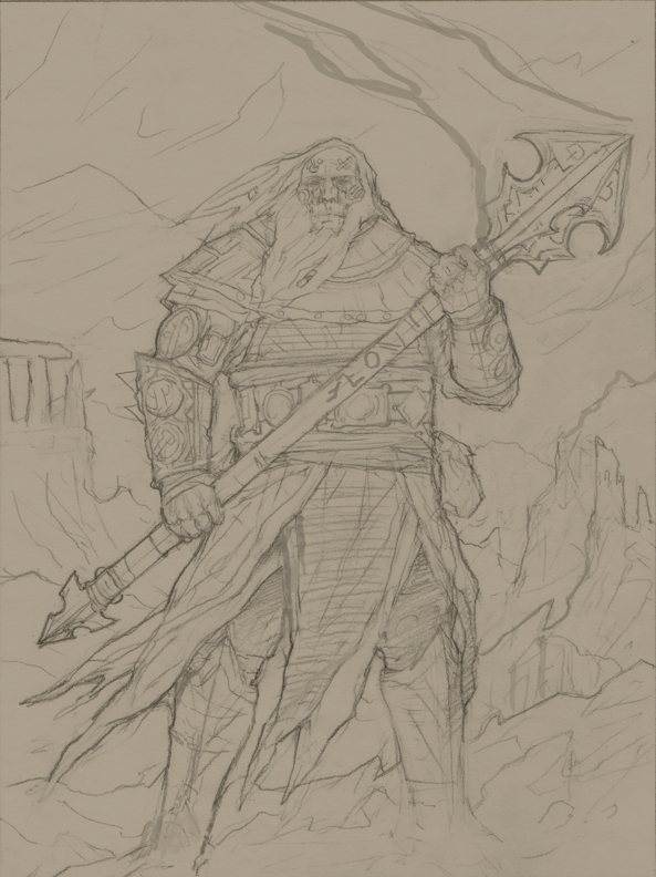
Forgeborn Drawing

The Forgeborn from the first article, now a drawing

With our artist selected, we needed next to think through our budget, the details and sequence of what we were commissioning, come to terms with the artist, and start the back-and-forth communication with him about what we wanted.

Of course, that makes it sound like a neatly ordered process!  The reality is a bit more complicated, because we were doing many things in parallel.  Justin was speaking to Chris about the scope of the project, and starting to communicate details of the Bastion world; he was also getting information about pricing on the portraits.  Meanwhile, we were scrambling to decide exactly what we needed.  We had not yet picked a specific deadline for a release of the game, nor did we have some external force – a conference, a meeting, etc. – driving us to have a particular packaging of the game ready by some specific time.  This meant we were getting the portraits done simply because they needed to be done sometime, and because we knew we wanted whatever version or demo of the game we showed off to already look good – and because our own vision of the denizens of Bastion would sharpen for being able to see examples of each.  (What we perhaps did not anticipate is how much we would learn simply from being pushed to describe these people, and their capabilities and environs, in detail.)

In our portraits, we knew we needed to show off a lot of different things at once.  These portraits needed to serve as exemplars, conveying identities and qualities, whether used as illustrations or userpics.  We knew we wanted to show all of the following:

  • Each of the five playable races of Bastion
  • Both genders
  • Each of the five known magical Traditions practicable by the characters
  • Common archetypes fantasy players might choose to portray
  • Common skills
  • Common situations

But if you try to show every combination possible of the above, you end up with a combinatoric monster that quickly eats whatever art budget you happen to throw at it (and you need to recruit an army or artists to boot).  So we decided to see what we could accomplish in ten portraits.  Ten gave us each possible combination of race and gender.  We then decided that every Tradition would be represented.

At this point, Justin sent Chris a huge email with the lowdown on all sorts of things about the Bastion setting:  background for the world, descriptions of each race, details of the Traditions, and so on.  Then he described what we wanted out of the portraits.  Chris liked the email, but asked that we give him more specific descriptions of how different elements should be paired up in the portraits; he was afraid that if it were left to him, he would mess up, forgetting to represent something somewhere.

So we went back, and started thinking through how to fit all these elements together.  Here, we did a lot of “overloading”, to borrow a computer science term.  This is a way of saying that we packed many meanings, many interpretations, into each portrait description.  A Mezoar looks out over a ruined expanse, holding his spear:  does he represent a warrior?  An explorer?  The idea of scouting?  A Lumyn calls and beckons to companions in the background.  Is she a leader, rallying the troops?  A Dreamsinger?  A mix of detail and ambiguity would be our friend here, allowing a small number of portraits to be used in many ways, and giving users a better chance to find a portrait that fit their ideas of a character.  We typed up ten descriptions that were our best effort to create this brew.

Lastly, Justin talked with Chris about the scope of each portrait.  He could invest different levels of effort, and put more or less effort, into each portrait, depending on how much we wanted to budget for them.  Chris sent some samples of the kind of work he could do for our target $ amount; this helped a lot, and we quickly agreed on our price point.  He also noted that the poses would probably not vary much from character to character, less for budgetary reasons than because of how we intended to use the portraits:    Then we picked two portraits to get started – a male Forgeborn warrior, and a female Lumyn Dreamsinger – and Chris got to work.

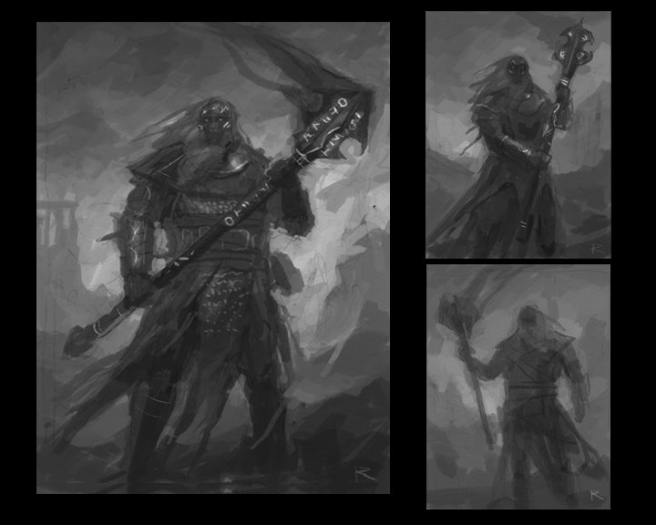
He was fast.  Really fast!  The first sketches appeared in days.  Now, bear in mind at this point that we had no idea how the artistic process would actually work.  Would we get lots of questions?  Would a painting just appear one day, crafted from whole cloth?  So I didn’t know exactly what I would find when I opened that first email (this was the point where Justin handed off artistic communication duties to me).  What we saw was the image from part 1:  Forgeborn Male Sketches

Three different sketches, exploring different poses and composition.

Chris also sent some ideas and questions for the Forgeborn.  Could we put him in a volcanic and ruined setting?  What sort of build should he have?  Did it matter what his weapon looked like?  Was he right to interpret the “skin like smoldering coals” as primarily dark, but with some grey and red elements?

I took the sketches back to Derek and Justin for their feedback, along with Chris’s message.  This is where we benefit a lot from being a team of liberal arts majors:  nobody feels unable to say valuable things about art!  Everybody was really excited; there was something validating for us in seeing that our project now had quality art associated with it, albeit in sketch form.  And we all agreed that Chris had really hit the nail on the head.  I assembled and collated everybody’s feedback; here’s the text of the critical feedback I gave Chris:

  • Everybody is very excited about what you have produced. We all agree that you’ve managed to evoke the essence of the forgeborn here.  As a result, most of our feedback is on the nitpick level.
  • Everybody loves the weapon, and the way the runes appear on it is spot-on. The solidity of the weapon matches well with the body and pose of the character.
  • The simple perspective, and a posture that reveals almost all of the face, both work well for enabling crops of the sketch for special purposes, particularly close-ups of the face that would work well for identifying a character in a chat or a turn summary.
  • Are we correct that what we see atop the character’s head is hair, and not flame or smoke?
  • There is room for the forgeborn to be even a little broader than this, though not much. The risk is them verging into classic fantasy dwarf territory, which is not what we want; however, the sense of granite-like sturdiness and power that you created is great, and could perhaps go even a bit further.
  • Are the runes a part of the character’s skin, or floating above it? We would prefer the former, and to keep runes off the center of the character’s forehead, so as to avoid any confusion with the rendering of a True Sight practitioner (who will manifest a sort of third-eye glow in that spot). The runes themselves are great: simple and angular is good.
  • On a related note, such runes are associated specifically with runecasting (the character’s magical ability), and not with the forgeborn per se. As such, there will be forgeborn without them, and other races who show them as well. However, there is no reason the runes on a forgeborn can’t manifest a bit differently from those on other races. For example, they might glow a lava-red, in keeping with the skin being like smouldering coals. They might even feel carved into the forgeborn’s skin, where they look more like paint or tattoos on another race.
  • There’s an object that might be a pouch on the side of the character. A pouch would be great; runecasters probably have a belt pouch where they keep physical runes.
  • You mentioned ruins as part of the background, and I would love to see that, as the environs of Bastion should include plenty of these. What you have right now looks like classic Greek- or Roman-style columns; that could work, but perhaps they could be taken a less-marbly, and more rough-hewn and natural direction, somewhere between the Parthenon and Stonehenge (for lack of a better descriptor). The idea would be to have an ancestral forgeborn ruin, in keeping with the volcanic environs.

You can see from this a number of questions that were on our minds that were very particular to creating art for a game.  We had to make sure our characters stood out from traditional depictions of fantasy races like dwarves and elves.  We had to focus on visual elements that tied together with in-game equipment, like the rune pouch.  We needed to do a lot to define the look of magic in our game, and to depict different kinds of magic so that each was immediately recognizable and distinct.  And we had to achieve that mix of familiar and exotic that allows players to feel they are in a fantasy world, but still something they can recognize and interact with – even down to the architecture.

Chris responded to our feedback, asked for a bit more information about the skin of the Forgeborn, then proceeded to create the drawing you saw at the beginning of this post.

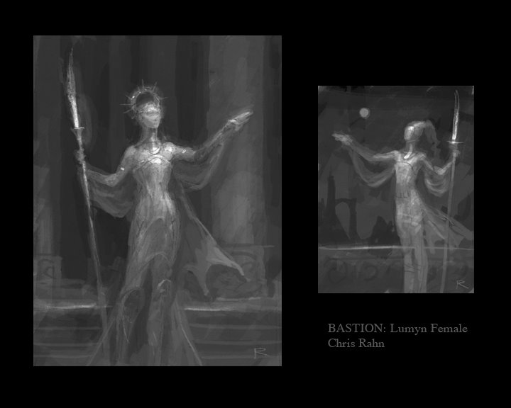
In the third and final post in this series, we’ll look at the female Lumyn, and how both she and the Forgeborn made it to painted form.  Here’s a sneak peek at the Lumyn sketches:

Lumyn Female Sketch

What we're playing: Machinarium

Machinarium is a point-and-click adventure game with an opening sequence I found irresistible.  It begins when a battered flying vehicle from a dense metropolis dumps its cargo of metallic refuse onto a junk pile.  Your first task?  Re-assembling Machinarium’s protagonist, a dilapidated little robot, from parts scattered in the refuse.

The game doesn’t reveal until much later how the robot ended up in such a sad state, but just on the basis of that opening, I became invested in its story.  And though the outline of that story is familiar, both the setting and characterization are so distinctive that it doesn’t matter.  The metropolis and its robotic inhabitants are simultaneously industrial and organic, and despite Machinarium’s complete lack of written or spoken dialogue, the protagonist has more personality than the human characters in many games.  Everything is conveyed through hand-sketched thought bubbles, animated gestures, and the occasional unexpected hoot or yelp.  There’s even a moment when the robot gets its groove on.

Just another reminder of how important characterization can be for getting the player invested in your game.

Bastion: A look at the art process, part 1

Forgeborn Male Sketches

The first sketches for the Forgeborn, as provided to us by Chris Rahn

This is our first post that specifically relates to Bastion, our primary project here at 10×10.  We’ll say more about Bastion as we get closer to having something ready for release; for now, suffice to say we believe we’ve hit on some important ideas about how a socially networked world interacts with old-school roleplaying, and that Bastion explores those ideas.

Though none of us are artists, we quickly determined that good art was critical to the experience of Bastion.  Bastion is a fantasy world, completely inhabited by nonhuman races.  It contains a lot of story, and flavor needs visualization as much as words, if not more so.  And so we decided that we needed to make art a part of the creation of Bastion from nearly the very beginning, paralleling the development of game mechanics and code.  (Ironically, I was the last one on the team to really embrace this idea, and I’m the one serving as our acting art director.  Go figure.)

Players of Bastion can choose from any of the five races who have made the Retreat to the city of Bastion.  We decided that it was critical to illustrate these races for players, and to give them a variety of options to choose from when selecting character portraits; we also knew we would tell better stories if we could visualize our own creations better.  So we began with character portrait art.

Immediately, we had a fork in the road to consider.  Should we try to find a starving artist to do the work?  A friend?  Or make the investment in an established artist?  In the end, we decided on the last approach.  Clichés like “you never get a second chance to make a first impression” and “a picture is worth a thousand words” exist for a reason; we needed to count on having spectacular art in place, art that would convey that this is not a dorm-room project, but a complete, professional, and, well, awesome game that deserves your time and attention as a player.  Established artists also have the benefit of extensive portfolios; you can browse and find an artist who really matches the aesthetic of your game.

To find the right artist, we looked at sources like Magic: The Gathering cards and Dungeons & Dragons sourcebooks, searching for art that evoked Bastion for us:  heroic, but mature; epic, nostalgic, dreamy; a little dark, but not horrific.  Each of us began posting images from sources that we liked, with Justin really taking the lead.  He also began writing to some of the artists, trying to get a sense of pricing and availability.  Remember:  none of us had worked with game artists before, nor portrait artists, though two of us at least had experience with creative teams and design/UI contractors.

Before long, we’d identified Chris Rahn as a likely portrait artist for Bastion.  He was available, friendly, responsive – and we loved the fit of his style with our game.  Of particular note were illustrations he had done for many cards in the Shards of Alara block for Magic.  These were images of real adventurers:  powerful, noble, but not cartoony; characters who could face the dark and turn it back.  And as Justin wrote to him about our goals and setting, you could tell that Chris was engaged by what we were doing, that he was into the idea.

I think that matters a lot.  An artist can be committed, efficient, and talented, and those are all good traits – but ultimately, you also need for him or her to care about what’s being created.  How many times have you seen a movie where it seems like the actors or director just didn’t care all that much?  And you could tell, couldn’t you?  The same goes for game art.  It is art, not just something you put on an assembly line, and cannot be treated as a mere product, by either the artist or the creative director.

In part 2, we’ll look at how we decided what should be in our first two portraits, and look at the back-and-forth process of refinement of the initial sketches.

The many games of Dragon Age

As was briefly touched on in an earlier post, Electronic Arts made the interesting decision when the launch of Dragon Age: Origins was imminent to release a free Flash-based game set in the same world called Dragon Age Journeys. Looking back on both the Flash-based and retail game now, it’s clear that both had a lot of shared background. The races, classes, and world history are all the same. Many of the abilities and the philosophies of combat were very similar. When discussing RPGs, that covers a lot of the bases.

And yet, in the end, the two games were so very different. Most of the people I’ve talked to who tried out Dragon Age Journeys didn’t find the game very engaging, and I’m afraid I didn’t either. Despite a multitude of abilities and some pretty sophisticated AI for a Flash game, the combat felt repetitive. The story felt thin. There just wasn’t enough to pull the player along.

The retail game, Dragon Age: Origins, was as we know almost the polar opposite experience. The story was fantastic, as is only to be expected from a Bioware RPG. The combat was always engaging, even 60 (or *cough* 80) hours into the game. Where in the Flash game it was, alas, difficult to keep pushing forward, the retail game was hard to put down. For those of us that study game design, it’s a valuable lesson.

But it was when the retail game came out for both the PC and the console that the story gets really interesting. These games tell the exact same story (if you played the same character in each one) with more or less the exact same graphics. Leading one to think that if they were to play the game on the console or on the PC, they would be playing the same game. But they would be wrong.

I had the chance to play a little bit of Dragon Age for the XBox 360 after beating the game on the PC. It’s an entirely different experience. The difference is in the combat engine, and it is dramatic. With the PC, you have at least 12 abilities at your disposal directly on the screen (more when you figure out that you can drag your action bar to expose more action slots–which I didn’t until after I had beaten the game and I will never forgive Bioware for ever ever ever…but I digress), 10 of which are hotkeyed. For the more restrictive console interface, you never have more than 6 actions available without having to bring up other screens in the middle of combat. The PC version allows the player to zoom the camera out until it (very elegantly) shifts from over-the-shoulder to top-down perspective for a better view of the entire battle. In the console version, you’re locked into the active character’s perspective (though you can hop from character to character in your party).

Essentially, combat in the PC version is a much more tactical experience, and this is by design. When I played the console version, I did my best to navigate the console UI to have my character be of some meager use in battle (I’m not very good at console games). The AI took care of the rest, and we were fine. If I tried to play such a weaksauce party in the PC version, we would have been annihilated. The PC version requires the player to frequently pause the game to direct their entire party. If you don’t, you will die. Think that group of genlocks and hurlocks up ahead should be easy enough to plow through on autopilot? Not on the PC: if you don’t pause and control your party in every single fight–especially in the early levels–you will die. It was hard. It was fun! For whatever reason, the Dragon Age team didn’t feel like they could or should replicate the experience on the console version, so they made the fights significantly easier. You can, in fact, more or less coast through the game on the console (at least as far as I have played). I found it made for a less powerful–and in the end less fun–experience. It’s remarkable how these games with so much in common, especially the different retail releases, can feel so different when you sit down to play them.

Powered by WordPress. Theme: Motion by 85ideas.