Latest entries »

“I rule!” vs. “That rules!”

On her blog Creating Passionate Users, game developer and author Kathy Sierra has often written about the need for products to create an “I rule!” experience for their users. And at their best, the web’s most popular apps do just that: Facebook makes us feel more connected, Twitter more popular, Basecamp more productive.

Those products are designed primarily for utility. For products that are meant to entertain, however, the intended reaction is less “I rule!” than “That rules!” We might get lost in the action of a movie or empathize with the protagonist of a novel, but the experience doesn’t need to leave us feeling more powerful for it to be compelling.

Part of what makes game development so challenging, I’ve recently realized, is that games can provoke both types of reactions. Intuitive and responsive controls, a steady increase in difficulty, a satisfying conclusion: these elements add up to an “I rule!” experience for players. Story and aesthetics, on the other hand, are key to provoking a “That rules!” reaction. The difficulty isn’t just that we need to worry about both goals when creating games; the goals themselves are sometimes at odds. Games that spend too much time in cutscenes, for example, risk making the player feel like a passive observer no matter how well written and rendered they are. And satisfying the player’s desire to rule often places constraints on the stories that we can tell or how we tell them: an unexpected death can be a powerful moment, but not if it causes the player to quit the game in frustration.

Considering the need for games to strike a balance between “That rules!” and “I rule!”, it’s not too surprising that some have trouble seeing games as art. Done well, a game is both art and application, art and not-art — and that’s one of the things that makes creating a good one so rewarding.

What we’re playing: Lord of the Rings Online

LotROI loves me my MMOs. The old cry of “SOW PLZ” from the trade channels of Everquest still ring in my ears (kids, ask your gamer parents). Though I’ve tried a great many, I never got very far in most of them. In fact, of all the MMOs I’ve played, I’ve only reached the endgame content in Daddy WoW. I made a great group of friends doing 10-man raid content in WoW:BC and WoW:WotLK. That time, alas, is past.

As Nick mentioned, it’s quite remarkable how much creating new worlds from scratch can devour one’s free time. Parenting does an impressive job of p0wning the rest. (L2P means ‘learn to parent while playing MMOs’, amirite? Haven’t mastered that one yet. I’m such a n00b.) It’s crushing me to watch Cataclysm’s release date approach and know that I won’t be able to play it. Because the fact of the matter is, while I’d still love to play, I can only seem to squeeze in a couple two-hour sessions a month no matter how hard I try. This, dear friends, makes the $15 subscription fee to continue the work of my beloved tank to free the world from evils great and small while keeping my friends from getting their faces melted cost-prohibitive.

So when I heard that Lord of the Rings Online was moving to a freemium model, I was thrilled. I’d stuck my head in the LotRO door a couple times in the past, so I already knew I’d love this game. Creating a new character and logging back in, it was everything I remembered. The graphics are gorgeous, the music is compelling, and there’s enough quest content to keep my lizard brain extremely satisfied smashing mobs and returning lost trousers to townsfolk in need. Plus, LotRO has something WoW will never have. Soon after I created my character, he crossed paths with a shadowy gentleman who went by the name of Strider. Strider was helping a Sackville-Baggins who was being pursued by a Ringwraith, but Strider in turn needed my help. He explained that there was a different Baggins that needed protection elsewhere–the true target of the Ringwraiths. Strider needed to get to that Baggins quickly before the Ringwraiths realized their mistake.

Um. Wow. Yes sir, I will help your cause.

Needless to say, I’m really enjoying LotRO, as little as I get a chance to play it. It’s firing on all cylinders for me. There’s just one problem. When you play as intermittently as I do, you end up missing out quite a bit on the “massively multiplayer” part of the MMO experience. I find myself agreeing with Leigh Alexander in her recent Kotaku post: no matter how much fun a game may be, it’s always more fun with a posse. But how can you gather a posse when you’re just not around all that much? We’re trying to answer that question in our own way with Bastion: Call to Arms, but I’d love to figure out a way to play with friends in the MMO environment as well, even if it’s just a couple of times a month. Has anyone else figured out a way to do that?

What’s wrong with Civ V?

I’m a long-time fan of the Civilization games, old enough to remember playing a cracked copy of the original Civ games on the university computers while in high school. (Yes, I pay for all my games now, thanks for asking.) When a new iteration of Civilization comes out, it’s a joyous event: not quite Christmas, but bigger than Halloween, y’know? So when I got my sweaty palms on Civ V, it was with a great deal of anticipation.

Developing a game doesn’t leave you with much time to play other games – one of those ironies they don’t tell you about. But I’ve managed to sneak in enough time with Civ V to end up… a little disappointed. Not such that I won’t play, or enjoy myself while doing so, but I’m not enthralled, not yet. Civ 2 and Civ 4, I each played for five years, all the way through until the next version came out. Civ 3, I played for maybe six months. There’s a danger Civ 5 will be another Civ 3 for me.

Why? What’s the problem? Did they simplify too many things, or the wrong things? Maybe, but I think it’s something else. I think it’s the vaunted new combat system – or, more precisely, the secondary consequences of that system.

One of the largest changes to Civ V is the elimination of stacked units. Now, each combat unit occupies a space that cannot be shared with any other unit. This, combined with the introduction of hex spaces, pushes the game into the tactical realm inhabited primarily by war games. And it does make the combat more interesting, on a per-engagement basis.

However, to make this work, each civilization needs to end up with an army that is much smaller on a per-unit basis than was common for any prior Civ game. There’s just not room on the map for them otherwise, and presumably they also wanted to limit the amount of time players needed to spend each turn just moving their armies around the board. Instead, you have tougher units, and more attacking and withdrawing and so on.

At least, that’s the theory. And sometimes it works out okay, and you get nice consequences, like more “leveling” of units as they survive and gain experience. But the big problem is that this means they need to make each unit more expensive to field. Creating an up-to-tech unit takes much longer in Civ V than in previous versions, and costs a whole lot of schmuckers to buy outright.

Okay, so what? Well, if we push further down the train of consequences, we get to this ugly one: if you defeat your enemy’s initial forces, they can’t rebuild in time for it to matter (unless the enemy is very large). As a result, it’s all about the early battles. Win those, and you will collapse the enemy’s empire and take it all for yourself. There’s a middle ground, but it is small.

Civ IV, by contrast, had both small and large wars. A number of things worked against large-scale conquering: the slow process of assimilating new cities, the effects of culture on newly-acquired border cities, war unhappiness, the ability to manufacture reinforcements reasonably quickly, and the ability to stack units in cities (which not only protected those cities, but also kept the reinforcements safe until there were enough of them to meet the enemy in the field). Civ V only has unhappiness penalties for new cities (and it doesn’t matter whether you are at war or not, so this is not a disincentive to further warring), and some policy and wonder bonuses available to boost combat prowess within one’s own borders – which won’t matter once you’ve lost your army.

And that’s really too bad, because it eliminates a whole dimension of gameplay, and makes the game swingy: be the first to bash another Civ’s head in, and you have a big leg up on the rest of the game.

Civ V gets a lot of other things right, particularly the addition of city-states, which are a huge and clever innovation that adds both to the mechanical gameplay, and to the realism factor in the game. And I will continue to play it, with some measure of happiness. But the main thing I’ve come away with is a renewed appreciation for the potential for unintended, second- or third- or nth-order consequences in the complex, dynamic system that is a game (especially one with as many variables as a Civ game). Something to watch out for.

Opening the black box

Many computer games are adaptations of a real-world gaming experience. Role-playing games, board games, card games, war games: all of these have made the leap from paper to computer, often many times over. But just as a good translation of a work of fiction or poetry is no small task, a good adaptation of the real-world game ain’t trivial. Far from it.

A sneaky problem is one we can call the “Black Box Problem”. Here’s the gist of it: Sometimes, when you take a game mechanic from a real-world game, and move it to the computer, the computer handles the mechanic for you. This turns up a lot in role-playing games, where the computer typically takes on the role of game master – but it’s far from restricted to the RPG world. And once you start hiding those mechanics, players run into problems.

To take a non-RPG example: The hit Magic trading card game came out in an online version many years after the original game was produced. Despite a frustrating interface and problems with outages, the service flourished. So what’s the most common complaint you hear in the Magic chat rooms? ”The shuffler cheats!” Here’s the problem: in Magic, you get a random hand of cards each time you sit down to play a game. Sometimes, that hand lacks a critical resource (“land” cards), or contains too many of them. You are at a major disadvantage with a hand like this. Get too many such hands in a row, and you get frustrated. In real life, there’s nobody to blame: you shuffled your own cards, you felt and saw it happen, and know that a bad hand was just unfortunate luck (or possibly not enough shuffling on your part). But online, the shuffling happens for you. And so if you see that streak of bad hands, your human pattern-matching mind can quickly go that place of deciding that Something Is Wrong… what is it? That black box shuffler!

RPGs are much more prone to this problem because the computer has more responsibility for managing the game experience and mechanics. This is particularly true if the RPG uses virtual “die-rolling” to decide whether players and their foes are succeeding or failing at their actions, from attacking to dealing damage to using skills. If the interface hides the die-rolling, and a player sees too many failures or successes in a row, he or she can easily end up drawing the wrong conclusions about why those failures or successes are happening.

Another common – and related – Black Box Problem in RPGs is hiding what factors are influencing conflict resolution. Does flanking my foe help with my attacks on him? What about being hidden? Am I a worse shot when firing at range? In melee? Does the rain help my stealth? Hurt my climbing? Which of my foes is better protected against my attacks? How do I know and learn this stuff? Paper RPGs have lots of ways to convey the answers: a rulebook (and one which players actually read), verbal descriptions of monsters and situations, being able to count on a good gamemaster to take the situation into account in the same way you do… and the chance to ask the gamemaster what will happen. All of these things are harder with a computer, and some impossible.

How you solve this problem in your computer RPG is up to you. Some games get very “open kimono”, showing % chances to hit, specific die rolls, and so on. That’s a fine approach, if your game is more about tactics than roleplaying, and if you are okay with not having the ability to hide much from players. But numbers tend to detract from the roleplaying experience for players, so consider using them with discretion. A description, like “excellent” or “difficult” can convey critical information without damaging verisimilitude. And sometimes you do want to hide information; sometimes, you have good reason to do so. The important thing is to be aware of the tradeoffs you are making between giving players the feedback they need to learn and play your game well – meaning that they feel mastery of their experience – and using hidden information to create dramatic surprises and suspense.

Boardgaming and the iPad

Board game publisher Days of Wonder recently announced the release of Small World, one of their popular boardgames, for the iPad. Rumor has it the popular “eurogame” Carcassonne will be showing up soon as well. Scrabble, already popular on the iPhone, now comes in an iPad version.

Like many people, I had trouble seeing exactly how to use the iPad when it was first shown to the world. It was cool and capable, certainly, but what was it for? What did one do with it exactly? Replace your computer? Your phone? Was it supposed to go on your coffee table? What was this thing?

Turns out that one answer is that it’s a killer boardgaming device. In retrospect, this makes a lot of sense. You have a display that’s large, colorful, and detailed enough to allow multiple players to read from and interact with it. The multitouch screen means moving pieces, scrolling and zooming the board, and shifting around cards are all easy, intuitive functions. You can lay it flat, so it can look a lot like a board or other playing surface. And the iPad is eminently portable, so it’s great for restaurants and travel.

Oh, and it’s a computer, so you always have a friend to play with. Small World might be missing an AI, but you can bet most other iPad boardgame releases will be packing a savvy computer opponent to keep you challenged during that subway commute or solo business flight. In this, it beats out the Microsoft Surface – that, and an order of magnitude in cost.

There are shortcomings. Hidden information gets difficult to manage, though perhaps a few games will take the Scrabble approach and allow players with iPhones to use their phones for exactly this purpose (players with iPhones can link them to the iPad game and use them to view and manage their racks). Display space is limited – probably too limited for many games. And there’s no substitute for the tactility of a hand of cards, or rolling dice – though nice sounds and animation can provide a different sort of sensory whiz-bang.

Perhaps, though, we are seeing something of the future of boardgaming here. For years, I’ve wished I could play Magic using a deck of electronic paper cards, saving me huge amounts of storage space, and the time it takes to manually pore through physical cards and put together a deck. An iPad as a game surface, and an iPhone for my hand of cards… well, that wouldn’t be so far off.

So what does this mean for the boardgaming industry? Perhaps very positive things. They are sitting on a chunk of intellectual property that just grew in value overnight, needing only some talented engineers to translate it to the new medium. In the short term, iPads and their coming brethren aren’t likely to cannibalize existing sales; dedicated gamers will be happy to pay a few bucks for electronic versions of their favorite games, and the games will see exposure to an entirely new audience. Longer term, it gets hazier: if the electronic experience grows to rival the physical one, and prices stay in the $5-10 range, then game publishers will begin to see a squeeze from shrinking margins.

It also means we can expect to see a shift in who works for boardgame companies. Many may partner with contract developers (creating something of a fun opportunity for talented developers with a gaming bent); however, if eventually the very nature of boardgame publishing changes to become more electronic, then the composition of the workforce at these companies will itself have to change. We can play out how this might affect distributors and local game stores, but that’s simultaneously straightforward and murky to predict.

Games themselves will change, too. There are things you can do electronically that are difficult or impossible with paper, cardboard, and plastic, from the aforementioned sound effects and animations, to complex randomness, to simple adjudication of time-based rules (e.g., who pressed the button first, timing of turns, etc.), to mid-game transformations of the board and pieces themselves. As a game designer, it is this last element that is perhaps the most exciting: a chance to mix the immediate social experience of boardgaming with the interactivity and under-the-hood power of the computer.

Printing business cards online

Business card front

Business card front ...

Business card back

... and back

A couple of weeks before we attended PAX East, we realized that it might be nice to have business cards to hand out. We created designs for the front and back, then looked for a site where we could upload them as JPEGs and place an order. In the process, we learned a few lessons.

Get feedback on your card design before ordering. Our initial design for the front of the cards used a palette of earth tones. When we showed it to our team of design experts friends, however, everyone said it looked like crap. (Literally, in a couple of instances.) We tried a few other palettes before switching to a simple but effective solution: we reused the main color of the back, which everyone had liked.

Be careful with colors. Some colors don’t look exactly the same in print as they do on a computer screen. We used a light, creamy yellow as an accent color, but the saturation level was low, and on the printed cards it doesn’t “pop” the way it does onscreen. The cards still look nice, but we’ll use a more saturated color on the next run.

Account for the “bleed” area. Print companies typically recommend that you reserve at least 1/8″ on all sides of your design to account for minor variations in where the cards are cut. (Many provide templates with the exact dimensions to use in pixels.) Text and foreground elements shouldn’t stray near this “bleed” area, as they might get cropped or lack a suitable margin depending on where the cards are cut. Backgrounds, on the other hand, should be “full bleed” and extend across the entire area; otherwise, you might end up with a bit of white around the edges of your cards.

Card size varies from country to country. 3.5″ x 2″ is the standard in the U.S., but the U.K. uses something closer to 3.31″ x 3.17″ (85 x 55 mm), and other dimensions are used elsewhere. We discovered this because we used Moo, a company founded in London, to print a set of cards showing off the fantastic portrait art Chris Rahn has done for us. (We’re up to six portraits in the Bastion gallery, with four more on the way.) When we decided to get our business cards from a U.S.-based company, we found that the dimensions needed to be different.

Research pays off. After looking at more than half a dozen online printers, we settled on Zazzle, which promised a remarkable turnaround time — just 24 hours to create the cards and get them out the door — at a fairly low price. And they delivered: the cards arrived on time and look snazzy, the issue with the accent color notwithstanding.

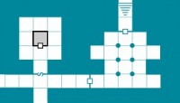
If you’re an old-school RPG player, you might have noticed a resemblance between our cards and certain adventure modules and maps. If not, we hope they’ll still catch your eye and give you a hint of what drives 10×10 Room: a sense of fun.

Bastion: A look at the art process, part 3

Forgeborn Male, Final

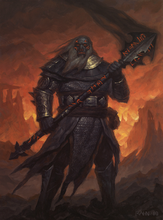
The final portrait, in full painted glory.

(This is the third and final installment of the “art process” series, looking at the development of the first art for Bastion.  If you haven’t yet seen them, you might first want to read part 1 and part 2.)

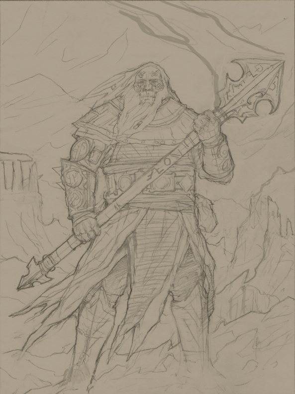
Once we saw the drawing for the Forgeborn, we knew we were in very, very good shape.  He was looking nice and broad in the shoulders now, barrel-chested and buff.  It was clearer what the look of the runes would be in the final painting.  The ruins were clearly present in the background.  And we could also see his rune-pouch more clearly.  Chris had responded to each of our topics.

My only concern at this stage was whether we were too close to classic D&D dwarf territory.  This is something we have to watch with all our art, as well as our character races, our monsters, our skills and abilities… almost everything in the game has to find a sweet spot between looking like Dungeons & Dragons (or Lord of the Rings, or World of Warcraft – the other two major cultural touchpoints for fantasy narrative and gaming), and simply feeling alien to players.  Different parts of the game handle this issue in different ways; in the case of the portrait art, and our concepts for the core races, it led us to develop races that are new and unique, but are clearly humanoid and share some characteristics with more common fantasy archetypes.  We also made sure to have races and images that are likely to appeal to a variety of different types of players:  the Forgeborn are great if you want to play somebody who looks solid and menacing, while those looking for a prettier face might pick a Lumyn, Nix, or Trow.

So, was our dude too dwarfy?  Was the beard a bad idea?  Derek and Justin said that no, the beard was not pushing the portrait into dwarfland – that once we had color, all would be well.  So we simply asked Chris to go ahead and turn the drawing into a final painting.

It didn’t take him long, but we still had to wait around a few extra days before actually seeing the final result.  This was because the process of photographing the art is apparently fairly laborious, and Chris was hoping he could save some time by photographing both the Forgeborn and Lumyn paintings together… which meant the Lumyn painting had to be completed as well.

Now, the process of getting the Lumyn ready for prime-time was pretty different.  Truth be told, we didn’t have to provide much feedback on the Forgeborn to get him from sketch to final painting; if you compare the big sketch with the final product, not much has changed.  Most of our work came in putting together the initial description of the art.

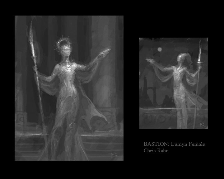
With the Lumyn, it was quite a different situation.  We asked Chris to come up with a character who showed qualities of leadership, as well as alchemy.  The result was not quite what we anticipated.  I’ll put the first Lumyn sketches up again here:
Lumyn Female Sketch

When we saw this, we all realized that “leadership” had not been a specific enough term.  We were thinking of battle leadership:  somebody who can direct tactics, calculate odds, and rally the troops.  What Chris had sketched was a different kind of leader:  something like a senator, a demagogue; someone who could lead in the city itself.  This poor Lumyn looked like she might break if she ever went on a wilderness adventure!

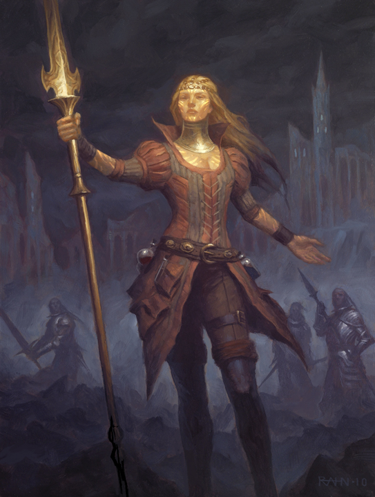
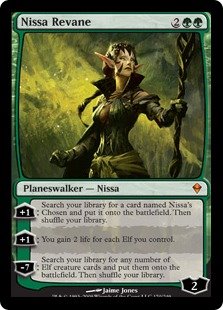
Before going back to Chris, we worked a lot to better describe our needs for the portrait.  For the first time, we offered up a specific visual cue, going through the archives of Magic artwork in search of a character that really showed off the leadership pose we were looking for, and eventually settling on this:
nissa

Here, we see a figure who is attractive, but strong; somebody headed forward into the forest, but looking back, either to consider, or to the (unseen) people who are following her.  It’s a good portrait pose:  you can see much of the body, and also get a great shot of the face.

It felt a little odd to be putting an image in front of Chris:  was this a good idea from an artistic direction standpoint?  Would it seem too constraining to Chris, or limit his imagination?  But we went ahead and did it, because we knew how important it was to get this pose right.  We then also asked him to move the Lumyn to a wilderness setting, asked him to emphasize heroism and action, and also asked him to put in more of a sense of her as alchemist – another problem with the original sketch, but less important (as we could always put alchemy in a different portrait if it wasn’t going to fit here).

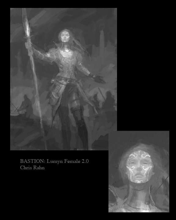
Chris was very nice about all the changes we were asking for, and quickly produced a new sketch that was much, much closer to what we needed:
Lumyn Female Sketch 2.0

Didn’t he nail it?  The pose, the practical-yet-elegant clothing, the setting, the other party members in the background, being beckoned… well, we felt pretty good at this stage.  There were still a few tweaks:  wanting to see that the markings on her face appear throughout here body, and therefore needing some skin to show up elsewhere; making sure the markings didn’t seem to be tattoos; trying to get more alchemy in.  With that feedback, Chris produced this drawing:
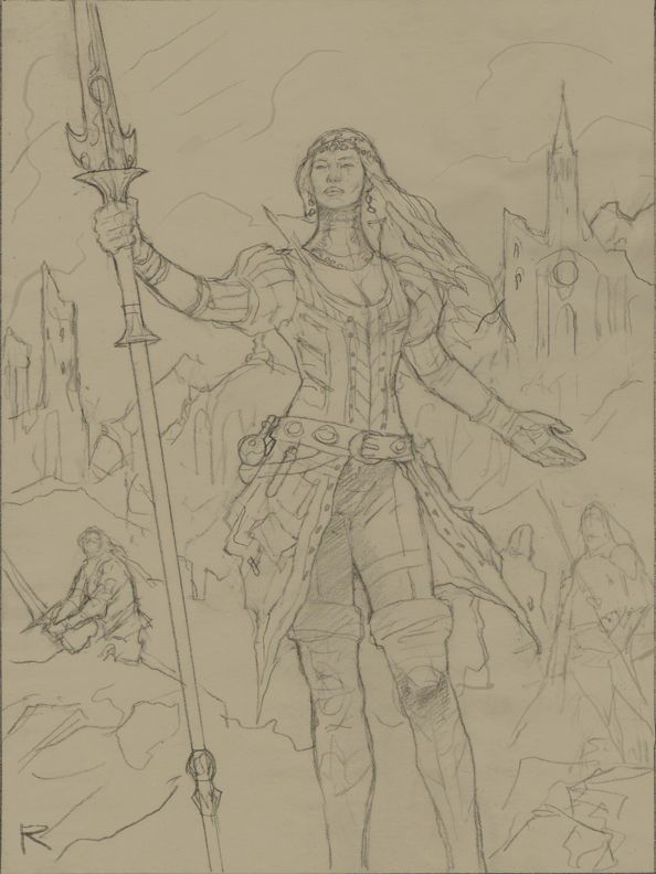
Lumyn Female Drawing

Yup.  Our only feedback was that the head looked a little small proportionate to her neck; Chris agreed, noting that he’d been trying to emphasize the elongated bodies of the Lumyn, but that the gorget then made things look odd.

And so finally we come to the end result:  our two portraits, complete:

Forgeborn Male, Final

Lumyn Female Final

And that’s that.  We were very happy with the end result, as well as the process itself, and now Chris is hard at work finalizing the next two portraits, which you’ll see soon in our new gallery.

Bastion: A look at the art process, part 2

Forgeborn Drawing

The Forgeborn from the first article, now a drawing

With our artist selected, we needed next to think through our budget, the details and sequence of what we were commissioning, come to terms with the artist, and start the back-and-forth communication with him about what we wanted.

Of course, that makes it sound like a neatly ordered process!  The reality is a bit more complicated, because we were doing many things in parallel.  Justin was speaking to Chris about the scope of the project, and starting to communicate details of the Bastion world; he was also getting information about pricing on the portraits.  Meanwhile, we were scrambling to decide exactly what we needed.  We had not yet picked a specific deadline for a release of the game, nor did we have some external force – a conference, a meeting, etc. – driving us to have a particular packaging of the game ready by some specific time.  This meant we were getting the portraits done simply because they needed to be done sometime, and because we knew we wanted whatever version or demo of the game we showed off to already look good – and because our own vision of the denizens of Bastion would sharpen for being able to see examples of each.  (What we perhaps did not anticipate is how much we would learn simply from being pushed to describe these people, and their capabilities and environs, in detail.)

In our portraits, we knew we needed to show off a lot of different things at once.  These portraits needed to serve as exemplars, conveying identities and qualities, whether used as illustrations or userpics.  We knew we wanted to show all of the following:

  • Each of the five playable races of Bastion
  • Both genders
  • Each of the five known magical Traditions practicable by the characters
  • Common archetypes fantasy players might choose to portray
  • Common skills
  • Common situations

But if you try to show every combination possible of the above, you end up with a combinatoric monster that quickly eats whatever art budget you happen to throw at it (and you need to recruit an army or artists to boot).  So we decided to see what we could accomplish in ten portraits.  Ten gave us each possible combination of race and gender.  We then decided that every Tradition would be represented.

At this point, Justin sent Chris a huge email with the lowdown on all sorts of things about the Bastion setting:  background for the world, descriptions of each race, details of the Traditions, and so on.  Then he described what we wanted out of the portraits.  Chris liked the email, but asked that we give him more specific descriptions of how different elements should be paired up in the portraits; he was afraid that if it were left to him, he would mess up, forgetting to represent something somewhere.

So we went back, and started thinking through how to fit all these elements together.  Here, we did a lot of “overloading”, to borrow a computer science term.  This is a way of saying that we packed many meanings, many interpretations, into each portrait description.  A Mezoar looks out over a ruined expanse, holding his spear:  does he represent a warrior?  An explorer?  The idea of scouting?  A Lumyn calls and beckons to companions in the background.  Is she a leader, rallying the troops?  A Dreamsinger?  A mix of detail and ambiguity would be our friend here, allowing a small number of portraits to be used in many ways, and giving users a better chance to find a portrait that fit their ideas of a character.  We typed up ten descriptions that were our best effort to create this brew.

Lastly, Justin talked with Chris about the scope of each portrait.  He could invest different levels of effort, and put more or less effort, into each portrait, depending on how much we wanted to budget for them.  Chris sent some samples of the kind of work he could do for our target $ amount; this helped a lot, and we quickly agreed on our price point.  He also noted that the poses would probably not vary much from character to character, less for budgetary reasons than because of how we intended to use the portraits:    Then we picked two portraits to get started – a male Forgeborn warrior, and a female Lumyn Dreamsinger – and Chris got to work.

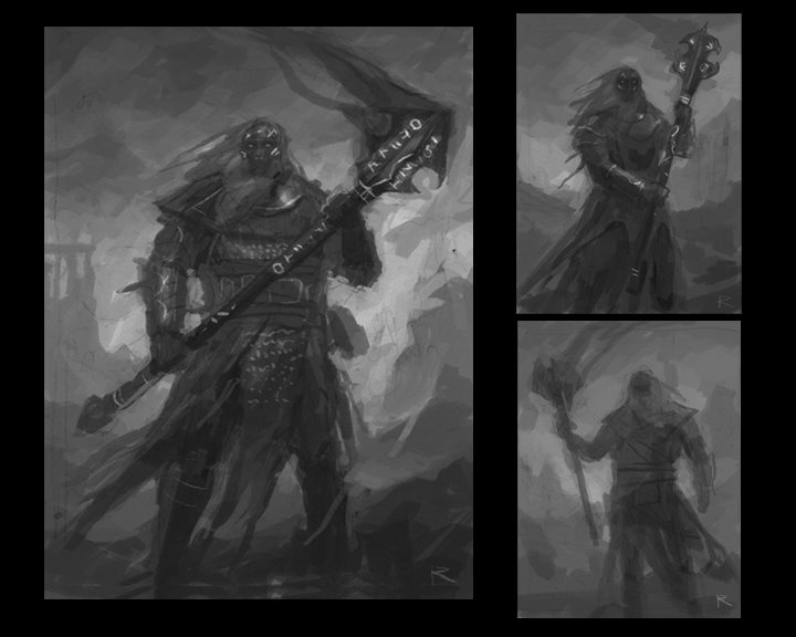
He was fast.  Really fast!  The first sketches appeared in days.  Now, bear in mind at this point that we had no idea how the artistic process would actually work.  Would we get lots of questions?  Would a painting just appear one day, crafted from whole cloth?  So I didn’t know exactly what I would find when I opened that first email (this was the point where Justin handed off artistic communication duties to me).  What we saw was the image from part 1:  Forgeborn Male Sketches

Three different sketches, exploring different poses and composition.

Chris also sent some ideas and questions for the Forgeborn.  Could we put him in a volcanic and ruined setting?  What sort of build should he have?  Did it matter what his weapon looked like?  Was he right to interpret the “skin like smoldering coals” as primarily dark, but with some grey and red elements?

I took the sketches back to Derek and Justin for their feedback, along with Chris’s message.  This is where we benefit a lot from being a team of liberal arts majors:  nobody feels unable to say valuable things about art!  Everybody was really excited; there was something validating for us in seeing that our project now had quality art associated with it, albeit in sketch form.  And we all agreed that Chris had really hit the nail on the head.  I assembled and collated everybody’s feedback; here’s the text of the critical feedback I gave Chris:

  • Everybody is very excited about what you have produced. We all agree that you’ve managed to evoke the essence of the forgeborn here.  As a result, most of our feedback is on the nitpick level.
  • Everybody loves the weapon, and the way the runes appear on it is spot-on. The solidity of the weapon matches well with the body and pose of the character.
  • The simple perspective, and a posture that reveals almost all of the face, both work well for enabling crops of the sketch for special purposes, particularly close-ups of the face that would work well for identifying a character in a chat or a turn summary.
  • Are we correct that what we see atop the character’s head is hair, and not flame or smoke?
  • There is room for the forgeborn to be even a little broader than this, though not much. The risk is them verging into classic fantasy dwarf territory, which is not what we want; however, the sense of granite-like sturdiness and power that you created is great, and could perhaps go even a bit further.
  • Are the runes a part of the character’s skin, or floating above it? We would prefer the former, and to keep runes off the center of the character’s forehead, so as to avoid any confusion with the rendering of a True Sight practitioner (who will manifest a sort of third-eye glow in that spot). The runes themselves are great: simple and angular is good.
  • On a related note, such runes are associated specifically with runecasting (the character’s magical ability), and not with the forgeborn per se. As such, there will be forgeborn without them, and other races who show them as well. However, there is no reason the runes on a forgeborn can’t manifest a bit differently from those on other races. For example, they might glow a lava-red, in keeping with the skin being like smouldering coals. They might even feel carved into the forgeborn’s skin, where they look more like paint or tattoos on another race.
  • There’s an object that might be a pouch on the side of the character. A pouch would be great; runecasters probably have a belt pouch where they keep physical runes.
  • You mentioned ruins as part of the background, and I would love to see that, as the environs of Bastion should include plenty of these. What you have right now looks like classic Greek- or Roman-style columns; that could work, but perhaps they could be taken a less-marbly, and more rough-hewn and natural direction, somewhere between the Parthenon and Stonehenge (for lack of a better descriptor). The idea would be to have an ancestral forgeborn ruin, in keeping with the volcanic environs.

You can see from this a number of questions that were on our minds that were very particular to creating art for a game.  We had to make sure our characters stood out from traditional depictions of fantasy races like dwarves and elves.  We had to focus on visual elements that tied together with in-game equipment, like the rune pouch.  We needed to do a lot to define the look of magic in our game, and to depict different kinds of magic so that each was immediately recognizable and distinct.  And we had to achieve that mix of familiar and exotic that allows players to feel they are in a fantasy world, but still something they can recognize and interact with – even down to the architecture.

Chris responded to our feedback, asked for a bit more information about the skin of the Forgeborn, then proceeded to create the drawing you saw at the beginning of this post.

In the third and final post in this series, we’ll look at the female Lumyn, and how both she and the Forgeborn made it to painted form.  Here’s a sneak peek at the Lumyn sketches:

Lumyn Female Sketch

What we're playing: Machinarium

Machinarium is a point-and-click adventure game with an opening sequence I found irresistible.  It begins when a battered flying vehicle from a dense metropolis dumps its cargo of metallic refuse onto a junk pile.  Your first task?  Re-assembling Machinarium’s protagonist, a dilapidated little robot, from parts scattered in the refuse.

The game doesn’t reveal until much later how the robot ended up in such a sad state, but just on the basis of that opening, I became invested in its story.  And though the outline of that story is familiar, both the setting and characterization are so distinctive that it doesn’t matter.  The metropolis and its robotic inhabitants are simultaneously industrial and organic, and despite Machinarium’s complete lack of written or spoken dialogue, the protagonist has more personality than the human characters in many games.  Everything is conveyed through hand-sketched thought bubbles, animated gestures, and the occasional unexpected hoot or yelp.  There’s even a moment when the robot gets its groove on.

Just another reminder of how important characterization can be for getting the player invested in your game.

Bastion: A look at the art process, part 1

Forgeborn Male Sketches

The first sketches for the Forgeborn, as provided to us by Chris Rahn

This is our first post that specifically relates to Bastion, our primary project here at 10×10.  We’ll say more about Bastion as we get closer to having something ready for release; for now, suffice to say we believe we’ve hit on some important ideas about how a socially networked world interacts with old-school roleplaying, and that Bastion explores those ideas.

Though none of us are artists, we quickly determined that good art was critical to the experience of Bastion.  Bastion is a fantasy world, completely inhabited by nonhuman races.  It contains a lot of story, and flavor needs visualization as much as words, if not more so.  And so we decided that we needed to make art a part of the creation of Bastion from nearly the very beginning, paralleling the development of game mechanics and code.  (Ironically, I was the last one on the team to really embrace this idea, and I’m the one serving as our acting art director.  Go figure.)

Players of Bastion can choose from any of the five races who have made the Retreat to the city of Bastion.  We decided that it was critical to illustrate these races for players, and to give them a variety of options to choose from when selecting character portraits; we also knew we would tell better stories if we could visualize our own creations better.  So we began with character portrait art.

Immediately, we had a fork in the road to consider.  Should we try to find a starving artist to do the work?  A friend?  Or make the investment in an established artist?  In the end, we decided on the last approach.  Clichés like “you never get a second chance to make a first impression” and “a picture is worth a thousand words” exist for a reason; we needed to count on having spectacular art in place, art that would convey that this is not a dorm-room project, but a complete, professional, and, well, awesome game that deserves your time and attention as a player.  Established artists also have the benefit of extensive portfolios; you can browse and find an artist who really matches the aesthetic of your game.

To find the right artist, we looked at sources like Magic: The Gathering cards and Dungeons & Dragons sourcebooks, searching for art that evoked Bastion for us:  heroic, but mature; epic, nostalgic, dreamy; a little dark, but not horrific.  Each of us began posting images from sources that we liked, with Justin really taking the lead.  He also began writing to some of the artists, trying to get a sense of pricing and availability.  Remember:  none of us had worked with game artists before, nor portrait artists, though two of us at least had experience with creative teams and design/UI contractors.

Before long, we’d identified Chris Rahn as a likely portrait artist for Bastion.  He was available, friendly, responsive – and we loved the fit of his style with our game.  Of particular note were illustrations he had done for many cards in the Shards of Alara block for Magic.  These were images of real adventurers:  powerful, noble, but not cartoony; characters who could face the dark and turn it back.  And as Justin wrote to him about our goals and setting, you could tell that Chris was engaged by what we were doing, that he was into the idea.

I think that matters a lot.  An artist can be committed, efficient, and talented, and those are all good traits – but ultimately, you also need for him or her to care about what’s being created.  How many times have you seen a movie where it seems like the actors or director just didn’t care all that much?  And you could tell, couldn’t you?  The same goes for game art.  It is art, not just something you put on an assembly line, and cannot be treated as a mere product, by either the artist or the creative director.

In part 2, we’ll look at how we decided what should be in our first two portraits, and look at the back-and-forth process of refinement of the initial sketches.

Powered by WordPress. Theme: Motion by 85ideas.